
THE PROBLEM
Casual and frequent fliers are overwhelmed with so many booking possibilities. They struggle to identify which itinerary offers the best value. Meanwhile, Airlines are incentivizing booking on their own sites, at the expense of Online Travel Agencies (OTA's) traffic and booking conversions.

Click above to play 2-minute demo

"For me, remembering [itinerary options] is hopeless, and writing down so much, becomes exhausting or illegible later."
-Christine on booking a flight (30 year old professional and frequent traveler)

PROJECT MOTIVATION
I fly frequently, and for a long time I had consulted over 5 websites on average to get what felt like the optimal flight for what I needed. I quickly realized that I wasn’t alone in this respect, and was inspired to better understand travelers' experience of the booking process and the business dynamics at play. I began this project out of my own passion and curiosity, and my own admitted excitement for the commercial flying experience. Mindful of my own bias, I aimed for a broad approach focused on learning about other fliers' booking behavior and psychology, and OTA business dynamics.
FOUNDATIONAL RESEARCH/COMPETITIVE ANALYSIS
To start, I wanted to understand who were the strongest OTA's and why. I honed in on companies that offered particularly unique services. Overall, I categorized airfare search tools and broke down their offering and core features, and any unique niches they were catering to. During initial industry research, I noted multiple data points indicating Major airlines were focused on incentivizing fliers towards booking on their own websites.

USER RESEARCH
Before starting User Research, I outlined a broad research plan that would focus on both qualitative and quantitative methods. First, I targeted users for in-depth interviews, prioritizing them based on frequency of travel, whether they booked themselves, and their comfort with mobile and desktop technology (disclosure: my users were all in the 25-40 year old age range). I then led multiple in-depth interviews, focusing on behavior and user psychology. Initial findings were added to and synthesized on an affinity map, in order to tease out more patterns and help guide next steps.

DEFINING THE PROBLEM
Throughout the user interviews, I was struck by and appreciated how much the research deviated from my assumptions. Some of the top insights were:
-Those who were spending a long time booking, were largely doing so because they were trying to decipher the best price
-Additionally, some users were comparing tools for booking beyond price, including miles or other loyalty program currencies, and were developing complex processes to analyze this information
These insights helped understand what was really going on and what problem to solve for. Considering that airfare forecasting is a feature well covered in the market (Hopper has probably been the most focused on distinguishing itself with the strength of it's prediction algorithm), I felt the strongest place to focus was integrating loyalty programs data. I couldn't find any OTA's that offered visibility into the miles or points redemption costs for a given trip. Additionally, the user research showed frustration and confusion around loyalty programs earning structures. This led me to focus the initial prototype on a more personalized product, that would provide more pricing options for travel, insight into earning value, and greater convenience for searching.

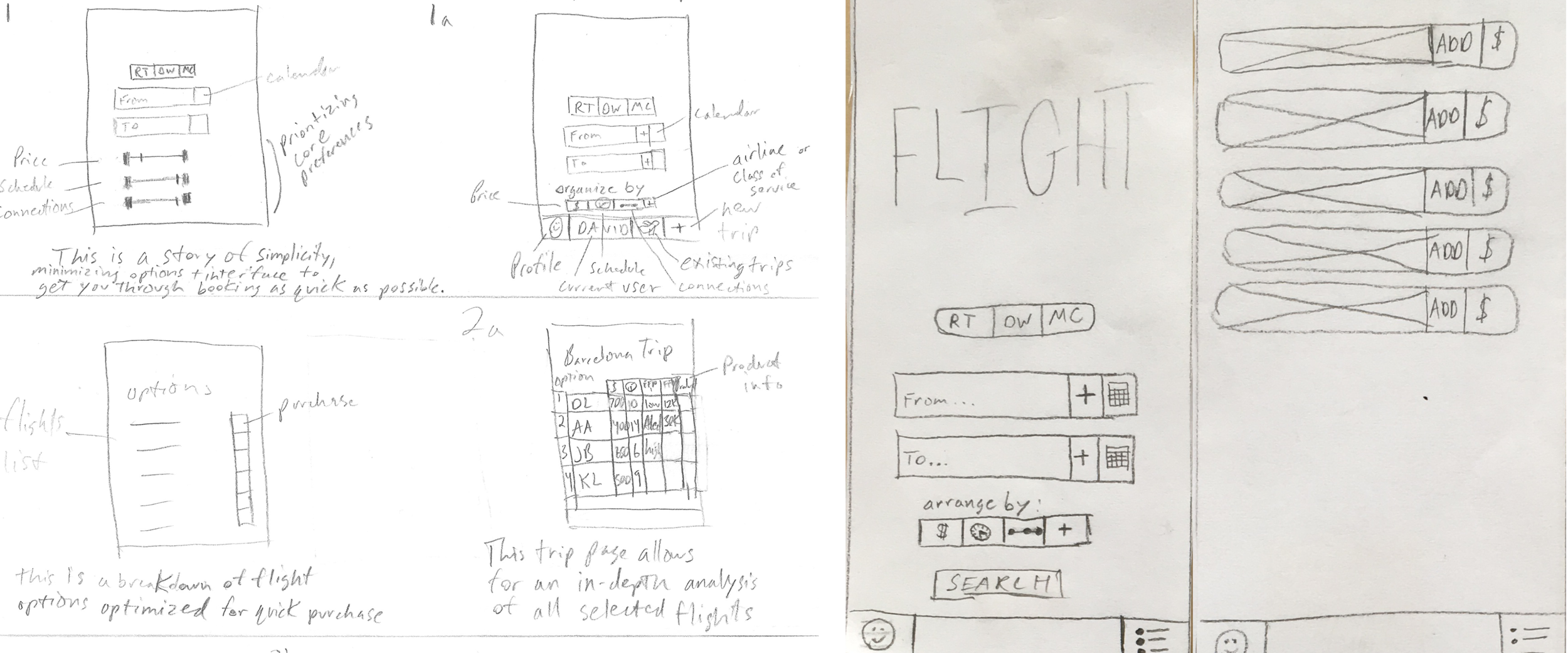
SKETCHING AND LO-FI PROTOTYPES
I initially sketched out a product which prioritized two separate interfaces for initial search results, and the option to save flights under a "trip" for further analysis. I sketched the most critical screens and tested a paper prototype the same day. These quick and dirty user yielded some essential insights right off the bat. They helped clear up basic confusion around what users were expecting for entering in their search parameters.
MID-FI WIREFRAMES & STYLE
I almost always feel I would prefer a longer research phase, but in this case was particularly determined to practice a lean, iterative approach. Focused on iterating quickly, I took my initial design and insights into Sketch to digitize, and then invision to test again with users. Given my passion for storytelling and visual design, while starting on mid-fi wireframes, I simultaneously took notes on a preliminary style guide and symbolic language for the app experience and how a user might interact with it's story.

FURTHER TESTING
With a higher fidelity prototype, I used Sketch's prototyping tool to test three users on my phone. I framed a scenario and observed them as they completed the task prompt. These insights and subsequent conversation with these users led to small fixes, the discovery of bigger I.A. and navigation errors, but also validated users' desire to better understand and navigate mileage programs. This phase also illuminated one glaring issue. To reduce clutter and prioritize on-the-go searches during transitional windows throughout the day, this early prototype divided initial search results from a saved "trips" screen. This concept increased the number of steps to conduct deeper analysis on real-time search results, and was intended to be the primary screen for airfare purchase. User testing showed that this was both redundant and even frustrating. Some users felt this multi-step UI was an obstacle amidst perceptions of rapidly shifting airfare pricing.

UI & HI-FI PROTOTYPING
Next I scrapped the multi screen analysis feature and focused on the look, feel, and sequencing of the first hi-fidelity UI. With invaluable critiques from fellow designers, I focused on how to clean up the UI and sequence critical information for when users most needed it. This also led me towards a more modular design that obviated the need for a multi screen UI for deeper analysis, and still minimized information saturation for the user. This shift helps the product focus on both casual users seeking the most common data for purchasing decisions, travel duration and price, while also maintaining the robustness of Flight for power users. Most importantly, this is where I implemented tools like the brand's "value symbol" to indicate where an itinerary had a disproportionate earning value with a specific mileage program. This feature, and the opportunity to view mileage redemption costs, demystify increasingly opaque mileage programs and offer a unique value proposition not currently offered in the OTA market at present. Most importantly, Flight aims to achieve this without overwhelming the casual traveler with too much information, offering helpful information only when desirable.

VALUE PROPOSITION
Flight's focus is to offer the best mobile tool for frequent travelers well versed in loyalty programs (the power user), while offering a clean, minimalist UI that educates casual travelers in the value of loyalty programs. Industry conversations have validated what I initially surmised, the insights from Flight (or Flight itself) could be a valuable tool for keeping users on an OTA platform. Increased complexity and opacity in frequent flier programs offer the opportunity for an OTA to clear up the emerging information asymmetries in mileage earning and redemptions, just OTA's originally did for the airfare market as a whole.
NEXT STEPS
My next aims for Flight are to test and speak with more segmented user groups to better gauge the strengths and weaknesses of the current prototype. Additionally, I'm reaching out to companies to assess whether Flight's value proposition and insights could fit into an existing OTA brand and offering. I'm also looking to target investors interested in developing a Flight MVP (minimum viable product), where the viability could be further tested.