DELTA MOBILE: In-app meal ordering and reservations
“I always feel rushed ordering food, it’s like you only have a few minutes to know what you want to eat.”
-Sharon (29 year old frequent Business traveler)

Our team was tasked with developing a new mobile feature for Delta Airlines. The Design problem was focused on the in-flight experience.

MY ROLE
I led the visual design and brand consistency component for this mobile feature, and collaborated on the planning and execution of the design process from project brief to the moment our team presented our design for review. Additionally, I spearheaded the design of a mapping feature that arose during the discovery phase
OUR CHALLENGE
With a broad directive in hand, our first challenge was to get more information so we could appropriately capture the project’s scope and make a clear plan. Consequently, we focused on areas that could be solved through mobile. Beyond that limitation, we were determined to cast a wide net and explore any solution that would provide outsized value for Delta users.

OUR APPROACH
To understand where gaps may exist in the industry and where innovation is strong, we began analyzing the competitive landscape we were operating in.

Once we felt comfortable with the terminology and identified trends in competitor mobile apps, we did our best to minimize bias and dismiss any assumptions. Our aim was to let our research guide the process. So we built a clear plan, created protocol to clarify scope when veering off-track, and focused on a system that time-boxed exercises to stay on schedule
THE DISCOVERY
Thorough research was paramount. We began by developing parameters within our research exploration to focus our user recruitment and interview process. Strong user recruitment was a top priority, because our goal was to focus on depth in our interviews. Making sure we were doing this with the right people was key. We used a screener survey and prioritized Delta frequent flyers with a moderate to strong facility with mobile applications. We conducted eight in-depth interviews to better understand our users and their behavior. After aggregating our data we used affinity mapping to explore patterns and identify the deepest insights. Making certain we kept our users top of mind, we developed personas from our research that we’d keep referencing throughout the design process.


THE STRATEGY
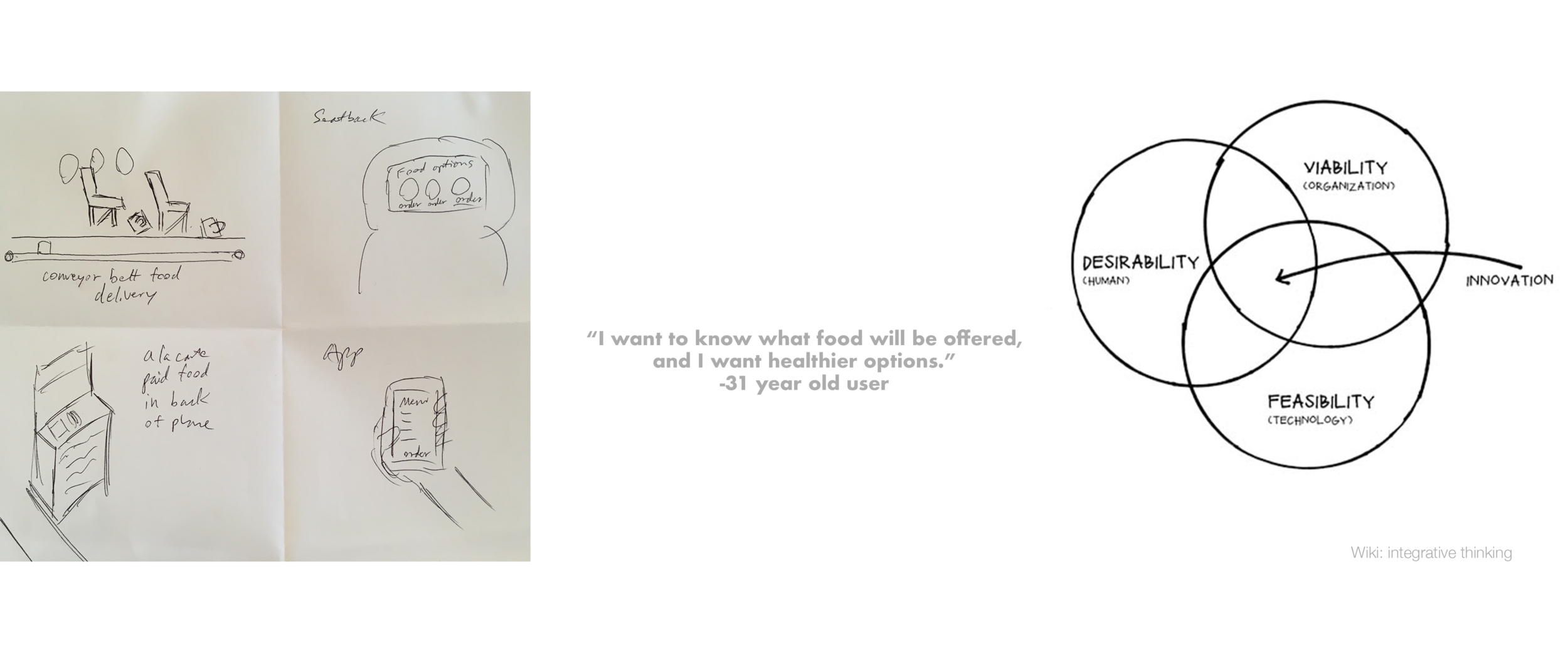
After determining our initial design scope, we timeboxed a rapid sketching phase to explore the most wide-ranging possibilities for solving our problem. Examining our sketches through a lens of user desirability, economic viability, and short term development feasibility, we further honed our scope and refined our solution. We recognized that users needed a way to browse a menu and order the food they wanted, on their timeline, and make sure that they’d get it. It was clear that many users felt overwhelmed with the in-flight food service, and unhappy with food options and availability. To tackle this head-on, we refined our hypothesis and began to sketch a solution and timeline a process of usability tests and product development from lo-fi sketches to a hi-fi prototype.
THE PRODUCT
The vision we came up with is a clickable menu accessible through any booked flight itinerary on the Delta app. Each flight segment has a digitized version of Delta’s existing on-board food menu, and offers an opportunity to either reserve a food item in advance or order an item on-board through the in-flight internet connection (available on all non-regional Delta flights). Passengers can view the menu in advance and select items to reserve (or purchase) as they like. One challenge that arose from this prototype was feedback indicating a likelihood of canceling advance food purchases. This led our team to modify the feature, offering only to reserve items prior to departure. We determined that an email reminder could be sent two days before departure, which would allow the passenger to quickly remove the item from their reservation, or 24 hours before departure their card would be charged and food item guaranteed. This allows the airline enough time to correctly stock the plane, guaranteeing the purchased food item, and provides passengers with significant time to cancel orders in the event plans change.

FRAMEWORK AND QUICK, ITERATIVE FEEDBACK
We made sure to keep updating our user flows and mobile app-map to stay organized and maintain task priorities. Additionally, I made certain we had Delta’s brand guidelines so we could maintain continuity with and build off their brand identity. Throughout this phase, we continued usability testing and integrating new insights. We learned that users were unsatisfied with the menu options and wanted a way to make suggestions. From these tests, we developed a new button and interface for passenger feedback, and a specific opportunity to give meal suggestions.


THE HI-FIDELITY DESIGN
At the end of our two week sprint, we continued to usability test as we refined the visual design and our presentation materials. Those tests still yielded potent insights and helped us refine the the feedback submission process and alter language that was yielding an aversive response in some users. The detailed design we arrived at aimed to both serve and improve the in-flight passenger experience, and also optimize revenue and growth in Delta’s in-flight catering business. For that reason, this prototype aimed to build out the user flows for the domestic in-flight menu, though the core features would remain consistent for international itineraries also (where in-flight dining is generally complimentary).

REFLECTIONS
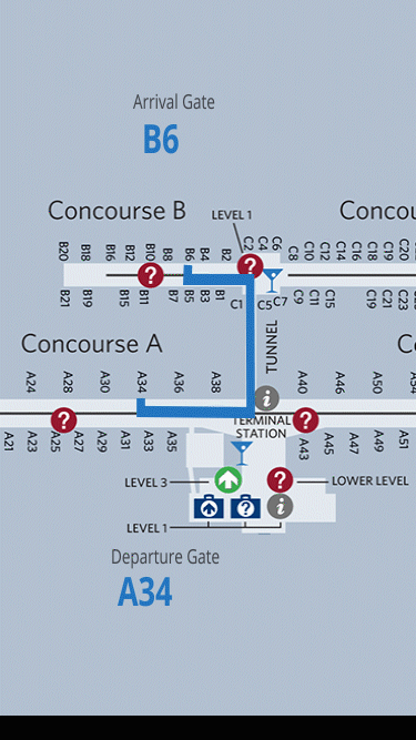
I feel the pressure of a sprint allowed for rapid progress, and kept us from getting hung up on details or challenges that in other workflows could’ve yielded long roadblocks. Conversely, I believe strongly in the power of robust research, and I feel if there had been the time and resources, more research time could’ve yielded a stronger footing from which to jump into design. Either way, I felt we arrived at an abundance of strong insights that guided the design process throughout, and yielded a product that delights passengers and increases efficiencies, revenue, and demand for the client. Additionally, we gathered so much rich user insight that we decided to pick off some low-hanging fruit near the end. Multiple users mentioned their frustration with connecting gates, and not having a map that could better point them in the right direction. Addressing this concern that was mentioned multiple times, I quickly mocked up a prototype that could solve this issue and integrate into the existing Delta maps.